
Main Menu
Latest Blog Entry
User login
Getting to grips with infographics and data visualisation.
“Sometimes Excel just has to be beaten into submission”
After many hours of staring at screens and wrestling with Excel, I have finished my final work on the “Introduction to Infographics and Data Visualization” course.
What started as interest in infographics turned into an understanding of how data should be presented in order to clarify and educate, rather than to obfuscate.
Not knowing what you don’t know
Do you know much about defence spending as part of GDPs, tax rates around the world for incomes over $300K, or the Eigen factor? Neither did I before this course started!
The sketch to the right shows my idea for an infographics showing how defence spending as a proportion of GDP is correlated with geographical location around the Middle East.
This is an example of the work we were assigned: look at existing data and how it was presented, then come up with an alternative way of presenting that data.
Marks were not given according to drawing ability (thankfully). Instead, we were encouraged to start with a blank sheet of paper and start with the end in mind.
This then lead to storyboarding and telling a story for the reader using images. My first effort on Academic tenure and what it means for University education in the USA can be seen here.
Thematic mapping and data:ink ratios
The course started off with reading chapters from Alberto Cairo’s “The Functional Art” plus watching video lectures. Extra reading included Stephen Few’s “Data Visualization for Human Perception” which goes through in some detail how the human eye can perceive height and depth, but less able to perceive area.
 This is important when choosing which type of graphic to use to present the data.
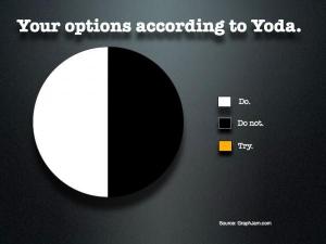
Pie charts are popular but are ineffectual in showing comparisons amongst data sets.
(The exception being this Yoda pie chart!)
It is easy to get caught up in what looks cool, rather than what is easy to interpret.
Pretty is different from functional.
Once you have chosen the right type of graphic, it then has to be made easy to read. The default option of programmes like Excel is to make things overcomplicated, but pretty.
A few simple edits and background effects that add little meaning can be removed, such as:
- gridlines
- extra words on axes
- too many different colours
- text that is replicated in charts
This increases the data: ink ratio
Making my eyes bleed
 Throughout the course, Cairo emphasised that design came first, the ability to use the software came second.
We were given access to adobe illustrator and tableau publishing software to help produce the graphics. However, I thought I would use Excel as I have got continued access to that.
I designed my Coach’s dashboard, then tried to programme accordingly. I then got sucked into a vortex of functions, formulae errors, circular references and other pop up boxes that constantly reminded me why I avoid spreadsheets.
I was inspired by this series of videos on Excel Tricks for Sports but was unable to get past the second minute!
My coach’s dashboard was designed to show an overall picture of work being done in the gym with that on the field and in matches. My experience has shown that often no one sees the overall work being done. (With young athletes factor in different sports and p.e lessons and the result is a shambles).
Here it is:
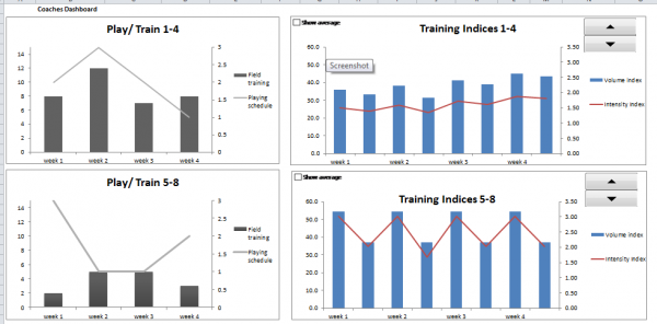
This is the front page of the Excel document, with test data and individual programming on the other sheets. The spin button is designed to scroll through players so that the coach can see how much work is being done by each player.
I split it into current work and future work. That way the coach can see how things are looking over the next 4 weeks, compared to the last 4 weeks. Pitch and gym time can be planned accordingly.
Without the overall picture, it is difficult to see what is going to happen.
 That was the theory: having the programming skill of an amoeba stopped it from working as I had wished!
Summary
The course was well set up with interaction amongst students, practical work, lectures and reading. I learnt quite a bit and in conjunction with reading Dan Roam’s back of the napkin, I think that my ability to use diagrams and portray data has improved.
This is an essential part of communication which almost every Coach says is important when coaching.
I absolutely detested getting stuck with Excel, exactly what I had tried to avoid. However, I have come through the other side and whilst no Excel Jedi, I might be an acolyte. (Too much time on Excel will lead to the Dark Side I am sure).
Thanks to Alberto Cairo for running the course. The opening quote came from Tara Richerson who runs a good blog on excel for educators and gave some great feedback to me. Thanks to Ollie Whitehead for providing some of the data.
I use a lot of this information now when delivering strength and conditioning qualifications as it helps the coaches present information more clearly to their athletes.
Previous MOOC: Crash Course on Creativity Next up: How things work .
Client Testimonials
 Paul Mitchell Golf Academy
With twenty plus years golf coaching experience working with all levels of golfer, I have sought after specific physical training for my more elite players. In this quest, I have worked alongside trainers who have worked with the very best golfers in the world. I can hand on heart say that James is the […]
More
Comments
[…] latest craze in competitive sport appears to be the use of data to aid understanding of, and improvement in sporting performance. This has resulted in a glut of […]
[…] to pie charts, this course on data visualisation has helped me become a better strength and conditioning coach due to clarity of […]
[…] Data Visualisation and Infographics […]
[…] Zealand Academy of Sport and has moved from sports science to coaching. He reviewed how he collects data, but more importantly how he can use it to help the coaches and athletes within the […]